Logos & Such
Posted Friday, 04/29/22
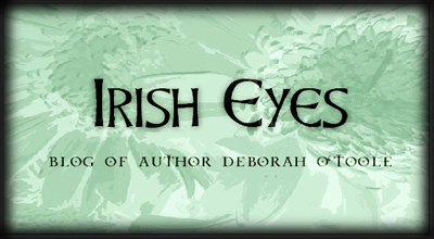
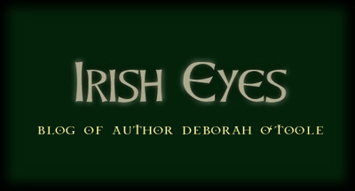
I thought it was time to re-do my blog (Irish Eyes) logo after more than a decade. The green eyes have been the mainstay since I began the blog, which is fine, but I think it's due for a change.
I've narrowed the new logo down to the two following images. I'm leaning toward the light greenish logo.
I posted an entry on my Facebook page to see which version of the logo people preferred, and the majority of them favored the light-green variation.
What do you think? To respond, please send me a comment by clicking here.
Tags:
Web Design![]()

